Flowers

Discuss every aspect of HDTP here.

Moderator: HDTP Team

Forum rules
Please do not feed the trolls.
Ajare
MJ12
Posts: 436
Joined: Wed May 18, 2005 2:16 pm

Flowers

Post by Ajare »

Image

299 polies, one 256x256 texture. Texture.

I'm still fiddling with the placement of the flowers and stems to cover as much as possible, but that's the basic thing.
User avatar
Jonas
Off Topic Productions
Posts: 14224
Joined: Sat Apr 24, 2004 9:21 pm
Location: Hafnia

Post by Jonas »

Can we comment on the texture? Because I think some more contrast on those flowers would do the trick. Apart from that, marvellous :D
Jonas Wæver
Chief Poking Manager of TNM

I've made some videogames:
Expeditions: Rome
Expeditions: Viking
Expeditions: Conquistador
Clandestine
User avatar
lofaesofa
UNATCO
Posts: 215
Joined: Thu Feb 10, 2005 12:10 pm
Location: UK

Post by lofaesofa »

Very pretty :)

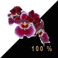
I think the original flowers look like pink orchids, having the dark central region with the very pale outside would look more exotic. You could add a couple of yellow/orange stamen to the middle of the flowers with two crossed planes. That'd probably look nice.

The soil, pot and the leaves are all great.
Darkshade
HDTP Member
HDTP Member
Posts: 487
Joined: Tue Dec 20, 2005 3:39 am
Location: Washington, USA

Post by Darkshade »

hmm.. I'm going to have to agree on that touch of lower contrast.
Looks awesome, though - great job!
User avatar
metche_steele
Illuminati
Posts: 1321
Joined: Thu Dec 09, 2004 4:45 pm

Post by metche_steele »

Ajare those flowers are absolutely beautiful! I agree with the comments about making them more orchid like - it'll be nice to see a little more colour introduced into the bloom. I think its outstanding though because it just looks so much better over the original - no comparison mate - so have a hearty HDTP slap on the back ;)
Last edited by metche_steele on Wed Feb 01, 2006 10:31 am, edited 1 time in total.
Ajare
MJ12
Posts: 436
Joined: Wed May 18, 2005 2:16 pm

Post by Ajare »

Ok, it seems pretty unanimous as to the changes. I'll get on it after work.

metche: sorry my fault - edited as discussed in PM.
User avatar
metche_steele
Illuminati
Posts: 1321
Joined: Thu Dec 09, 2004 4:45 pm

Post by metche_steele »

Dont know how useful this pic is but might be nice as a ref ->

Image
EER
Illuminati
Posts: 2486
Joined: Sat Oct 22, 2005 7:52 pm
Location: NL

Post by EER »

Great flowers, I also like the texture even though it's a little different.
thebert
Thug
Posts: 10
Joined: Thu Dec 22, 2005 12:16 pm
Location: Italy

Post by thebert »

Have you tried to keep the dark line on the lower edge of the pot as in the original? IMHO it would be better. Anyway,very good work =D>
Ajare
MJ12
Posts: 436
Joined: Wed May 18, 2005 2:16 pm

Post by Ajare »

Ok, latest revision.

Image

The texture looks a bit washed out because there's no lighting on it. For some reason DX lights this sort of thing better than Max.

Added the lower rim on the pot, and changed the flower a bit. I'm having difficulty getting more contrast in without it looking unnatural. I'm beginning to love the dodge, burn and smudge tools, now that I know how to use them properly. :)
dirty harry
Thug
Posts: 35
Joined: Fri Dec 16, 2005 11:54 pm
Location: Scotland

Post by dirty harry »

woah, thats-a-spiceymeat-a-ball-a!

very nice.
"I spill, my drink!"
User avatar
Christian
Thug
Posts: 31
Joined: Sun Jan 01, 2006 5:43 pm
Location: Denmark

Post by Christian »

I was comment on the first one, seeing as it looked like a weapon, but it looks great now! :)
EER
Illuminati
Posts: 2486
Joined: Sat Oct 22, 2005 7:52 pm
Location: NL

Post by EER »

Well done, I think it looks great. Keep the good ones coming :D
Rick-sama
Thug
Posts: 44
Joined: Fri Dec 09, 2005 4:02 am

Post by Rick-sama »

i would add a little more black to the middle of the flowers, but besides that, good work! :smile:
User avatar
metche_steele
Illuminati
Posts: 1321
Joined: Thu Dec 09, 2004 4:45 pm

Post by metche_steele »

Fantastic! Those flowers look beautiful.
Post Reply