HDTP comment/bug/suggestion thread (w/ pics)

Discuss every aspect of HDTP here.

Moderator: HDTP Team

Forum rules
Please do not feed the trolls.
User avatar
XYZ
Thug
Posts: 12
Joined: Sat Sep 30, 2006 8:15 pm

HDTP comment/bug/suggestion thread (w/ pics)

Post by XYZ »

First of all, I'd like to say that the new HD objects are a joy, particularly the basketball, the alarm panel, the clay pot with money inside, the outter/inner doors, and so on. There's a lot to love here. Big thanks to everyone who invested the time and energy in making all this possible.

Now on to the bugs, comments, and suggestions.


Bugs & Mistakes

1. Push Cart - doesn't push anymore after being thrown
2. Flagpole - the base of the flagpole has the chinese word for "China" inscribed into it, but the texture's shared by the Chinese as well as the US flagpole
3. Missing Texture - the underside of the trophy is untextured.
Image
4. ???? - From a distance the texture is stretched, looks fine up close.
Image


Commentary
I left smaller details alone (too subjective) whilst concentrating on a few major deviations which are above subjectivity. They're just different from the original by a big margin.

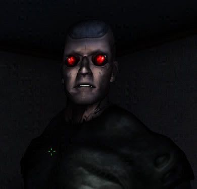
1. Gunther - decidedly different from the original

1a. Forearm - as you can see, the new forearm is ... less than human :?
His biceps are huge whereas the forearms are barebones.
Due to his muscles, the original's elbows cock back, they point to the back, not the sides.
Image

1b. Cervical Spine - Original Gunther's neck is extraordinarily wide (the new neck is up to the green line).
This extra girth is due to augmentation, some kind of spinal reinforcement in addition to his metallic scalp. It's not built-in, but on the outside of the body, an exo.
Image

1c. Front - Muscles of his shoulders should be wider than his chest. And the abdominal muscle caves inward in the new version (?) I included a small shot of the original to show the visible definitions.

Also, the new version's eyes are way too big. The original appears to have had his eye sockets expanded to fit whatever they put in his eyes, but the red lenses are relatively small.

Rest of the facial features should have a topic of their own.
Image

1d. Back - New gunther has the frame of an ordinary human, whereas the original is built. Notice the shapes.
Also the details on the back are missing - the strange protrusions of the shoulder blades and spine, again reinforced skeleton.
Image

1e. Colors - original has this blueish metalic color, and they match. The new version deviates from this.
In the red circle is his torso, which is black in the original.
Image

1f. Details of the Back - another shot of all the details of his backside
Image

1g. Bug Eyes - once in a while the texture stretches and the face becomes like this.
Image


2. Toilet - It looks like I'm gonna fall into the new toilet if I use it. The original's not very practical either, but it has a lot of character for being original.
Image

3. The animation for the new crowbar and baton - Not bad when hitting objects, but appears to be very stiff when waving about through the air.

4. The general supply crate doesn't have the red numbers (225).
Last edited by XYZ on Mon Oct 02, 2006 1:29 am, edited 8 times in total.
User avatar
XYZ
Thug
Posts: 12
Joined: Sat Sep 30, 2006 8:15 pm

Post by XYZ »

Suggestions for Future
1. Faucet - Shoots "water pillets" like the showerhead, please give it the effect of running water like the urinal.
Image

2. Ambrosia Container - The sides now have definition (very nice), but the 2 bolts and the whirly thing are still a flat texture. Please give those some definition also :D
Image

3. Turret - Only the base ammo unit is in HD (Someone brought this up already?), the barrel is still hexagonal.
3a. New ver. in the background
Image
3b. New ver. in foreground
Image

4. Zombie - PLEASE do something/anything about his guy. He is much more upclose in Battery Park lvl than this Liberty Island shot. It looks like they plucked him from System Shock 2.
Image

5. Wall TV - Very Fahrenheit 451, cept it looks LIKE ASS!!! Please do improve! :)
Image

6. The Dirty Toilet - Can we make this one not flush? :D To make it overflow would be nice, but not necessary. Not flushing would be a bid of cool detail.


Questions

New version is on the left I take it? Right one has a lot of textural problems.
Image

This looks new, although I didnt see it in the demo map.
Image

And finally, new ammo boxes? I remember seeing the HD 10mm box on moddb, but it wasn't included in this release?


Again, this is a terrific effort for the first release. :P
Last edited by XYZ on Mon Oct 02, 2006 1:34 am, edited 3 times in total.
justanotherfan
Illuminati
Posts: 2285
Joined: Sun Feb 27, 2005 11:28 pm

Post by justanotherfan »

This is the first I've seen of the new demo, and it looks very impressive.

That was well thought out, and well illustrated, I have to say. I agree with you on probably everything. Gunther is made to look more like a human now, but you've pointed out things like the shoulders and the arm etc that are important.
User avatar
ThalesA7X
HDTP Member
HDTP Member
Posts: 495
Joined: Wed May 24, 2006 12:13 am
Location: Texas
Contact:

Post by ThalesA7X »

Okay, I just want to comment on the turret stuff. :)

Only the base is in this package. The top is not done (I think.) yet.
User avatar
Trestkon
Off Topic Productions
Posts: 2820
Joined: Sat Apr 24, 2004 9:03 pm
Location: Canada
Contact:

Post by Trestkon »

ThalesA7X wrote:The top is not done (I think.) yet.
Correct.
-Life does not snap to the x-axis
User avatar
ThalesA7X
HDTP Member
HDTP Member
Posts: 495
Joined: Wed May 24, 2006 12:13 am
Location: Texas
Contact:

Post by ThalesA7X »

yeah, thought so. i am too tired to check the manager and see...good night.
User avatar
James T
UNATCO
Posts: 130
Joined: Sat Sep 30, 2006 4:35 am
Location: Brisbane, 'Straya

Post by James T »

It seems to me that Gunther's structural changes were intentional, but I agree entirely in regards to posture.

Pixxxx!!!!

Image
Now, that actually looks quite good as a snap, doesn't it! But this is the 'aliasing' (probably the wrong word) )I was talking about regarding his mouth -- see, his mouth is actually fully-closed in this shot, but the white of his teeth is still kinda... strobing through. Is there a fix for this? (perhaps modeling the inside of his lips as well as the outside? It'd mean more polygons, but hey, I dunno.)

Image
The crates have some weird lighting, like the 'panels' are lit independently of the 'planks', which ain't right. The really big green 'military' crates do this too, with their panels and crossbars, but I didn't get a good shot of it (damn DX snapshot murkiness!) The whole 'soft edges' thing you already know about (I imagine that adding an 'edge' to the texture, rather than relying on the lighting alone, would fix that, but what the hell do I know?). But yeah, the lighting -- what's the deal with that?
"If all Americans want is security, they can go to prison." -- Dwight D. Eisenhower
DDL
Traditional Evil Scientist
Posts: 3791
Joined: Mon Oct 17, 2005 10:03 am

Post by DDL »

Wow, so much to comment on.

I'll try and adress everything in order.

Pushcart: the only thing (THE ONLY THING) different between this and the original is the mesh. There are no code changes, if it doesn't move when you throw it, then neither would the original. Are you sure you're not remembering incorrectly? It will roll if you bump it, but the code isn't sophisticated enough for it to do so when you throw it.

Flagpole: only two skins for this were available at the time of release (the original has 5!), so I assigned the two to "Anything vaguely Non-US == chinese, anything vaguely US == American", because I'm a great fan of gross generalisation. :)

The writing on the base would probably not be too hard to remove and leave only on the chinese skin, though.


Trophy: interesting. I don't think that model even has any polys there. I'm not a modeller, but I don't think it would be too hard to fix. Well spotted!


Bench: I've noticed things like this, too. I fear that we may be bashing against the limits of what the engine can handle here: many high-res 'sheet-like' elements of meshes (back of the bench, blades of fan2, struts on unbreakable crates) get 'cut off' at distance, sliding back in to view as you get closer.

Unless this is a Lod setting (phas?) I don't think there's anything we can do about this. I shall investigate.

Gunther: not saying anything :). Not my field of expertise, plus I love the new version. Actually, I will say that it is possible to get ridiculously hypertrophic upper arms without developing the lower arms much. Especially if you're sticking bits of machinery in there.

The texture stretching is really odd, though: it looks like what you see if you force a blendanim without any tweening -trying to make the mesh shrug while still crouch running, or something-, which (for those very reasons) no one ever does. I've never seen it, myself. Is it only in conversations? I shall investigate.

Oh, and the roadblock probably wasn't in the demo map because I forgot. There are like, hundreds of new meshes in this release, and they're in all sorts of different categories (even the decos are under various things like 'electronic devices', 'HACKABLE electronic devices', 'hackable BREAKABLE electronic devices' and so on and so forth for near infinite subcategories).

So I may have missed a few. Again, well spotted! I'll add it to the update.
User avatar
Jonas
Off Topic Productions
Posts: 14224
Joined: Sat Apr 24, 2004 9:21 pm
Location: Hafnia

Post by Jonas »

XYZ wrote:1. Faucet - Shoots "water pillets" like the showerhead, please give it the effect of running water like the urinal.
I doubt there's any way to do this properly, it's likely to look like ass no matter what they do. It's probably best to leave it.
Wall TV - Very Fahrenheit 451, cept it looks LIKE ASS!!! Please do improve! :)
World textures are at the bottom of the HDTP people's to-do list. But once it's time to recreate those textures, I'm sure monitors and the like will be among the first to receive attention.
The Dirty Toilet - Can we make this one not flush? :D To make it overflow would be nice, but not necessary. Not flushing would be a bid of cool detail.
I disagree. The fact that a toilet is dirty does not necessarily mean it cannot flush. The dirty toilet in Deus Ex could flush, so the dirty toilet in HDTP should be able to flush as well.
New version is on the left I take it? Right one has a lot of textural problems.
lol, I'm quite surprised you even have to ask! :lol:
And finally, new ammo boxes? I remember seeing the HD 10mm box on moddb, but it wasn't included in this release?
No new ammo boxes were included in release 1 of HDTP. I'm looking forward to gaining that enhancement in the next version though.

Nice comments though.

Oh, and I disagree about Gunther, altering anything about him would probably put an extra month or two of work on Phasmatis, time he could otherwise spend pouring his love into other, not actually completed assets ;)
Jonas Wæver
Chief Poking Manager of TNM

I've made some videogames:
Expeditions: Rome
Expeditions: Viking
Expeditions: Conquistador
Clandestine
DDL
Traditional Evil Scientist
Posts: 3791
Joined: Mon Oct 17, 2005 10:03 am

Post by DDL »

James T: the lighting on the crates is more of an engine thing than anything else: an extremely annoying thing, but not one that can be easily circumvented.

Think of it as calculating light and shade across a give polygon: it's poly specific, not scale specific. The 'main body' of the crate probably has only the two triangles, whereas the 'strut' faces ALSO have only two triangles, but are much smaller/thinner: the lighting algorithm treats them much the same, so while it puts the same amount of light (proportional) on both, you see far more light (absolute) on the main body than you do on the struts.

You wouldn't get this with the originals, because they were just cubes. Two polys per face, six faces. Yes, that basic.

It's a very tricky one to fix, to be honest.
User avatar
XYZ
Thug
Posts: 12
Joined: Sat Sep 30, 2006 8:15 pm

Post by XYZ »

Jonas wrote:
XYZ wrote:The Dirty Toilet - Can we make this one not flush? :D To make it overflow would be nice, but not necessary. Not flushing would be a bid of cool detail.
I disagree. The fact that a toilet is dirty does not necessarily mean it cannot flush. The dirty toilet in Deus Ex could flush, so the dirty toilet in HDTP should be able to flush as well.

Oh, and I disagree about Gunther, altering anything about him would probably put an extra month or two of work on Phasmatis, time he could otherwise spend pouring his love into other, not actually completed assets ;)
See, that's just it. I can understand something being too difficult or is prioritized for later, but to say that one thing should be 1:1 while another doesn't is rubbish.

I like the new Gunther model a lot, especially his cheek and jaw. But it's just not the Gunther as we know it. If you call 1:1 on the toilet, everything should be 1:1.
User avatar
metche_steele
Illuminati
Posts: 1321
Joined: Thu Dec 09, 2004 4:45 pm

Post by metche_steele »

XYZ wrote:
Jonas wrote:
XYZ wrote:The Dirty Toilet - Can we make this one not flush? :D To make it overflow would be nice, but not necessary. Not flushing would be a bid of cool detail.
I disagree. The fact that a toilet is dirty does not necessarily mean it cannot flush. The dirty toilet in Deus Ex could flush, so the dirty toilet in HDTP should be able to flush as well.

Oh, and I disagree about Gunther, altering anything about him would probably put an extra month or two of work on Phasmatis, time he could otherwise spend pouring his love into other, not actually completed assets ;)
See, that's just it. I can understand something being too difficult or is prioritized for later, but to say that one thing should be 1:1 while another doesn't is rubbish.

I like the new Gunther model a lot, especially his cheek and jaw. But it's just not the Gunther as we know it. If you call 1:1 on the toilet, everything should be 1:1.
Like ive always said we keep everything as close to the original as possible. I believe weve succeeded in doing this. However, have you ever tried reskinning a character from scratch, trying to make it look at close as the original as possible while trying to up the detail? Id give it a go mate ;)
User avatar
XYZ
Thug
Posts: 12
Joined: Sat Sep 30, 2006 8:15 pm

Post by XYZ »

metche_steele wrote: Like ive always said we keep everything as close to the original as possible. I believe weve succeeded in doing this. However, have you ever tried reskinning a character from scratch, trying to make it look at close as the original as possible while trying to up the detail? Id give it a go mate ;)
Good point. It is difficult. But isn't that what this is about? Tackling the difficult job of creating HD versions of the original?

That wasn't criticism at all, so please don't feel defensive. I just hope that when the final release comes around, Gunther would look like Gunther down to the finest details.
User avatar
metche_steele
Illuminati
Posts: 1321
Joined: Thu Dec 09, 2004 4:45 pm

Post by metche_steele »

XYZ wrote:
metche_steele wrote: Like ive always said we keep everything as close to the original as possible. I believe weve succeeded in doing this. However, have you ever tried reskinning a character from scratch, trying to make it look at close as the original as possible while trying to up the detail? Id give it a go mate ;)
Good point. It is difficult. But isn't that what this is about? Tackling the difficult job of creating HD versions of the original?

That wasn't criticism at all, so please don't feel defensive. I just hope that when the final release comes around, Gunther would look like Gunther down to the finest details.
No worries :)

But youve just highlighted my point - how CAN we make him look like gunther down to the finest details, when you simply cant see the finest details in the original texture, to begin with?

Its impossible - so we have to fill in the gaps and of course not everyone is gonna agree with it :) We simply have to agree to disagree!
User avatar
James T
UNATCO
Posts: 130
Joined: Sat Sep 30, 2006 4:35 am
Location: Brisbane, 'Straya

Post by James T »

DDL wrote:James T: the lighting on the crates is more of an engine thing than anything else: an extremely annoying thing, but not one that can be easily circumvented.

Think of it as calculating light and shade across a give polygon: it's poly specific, not scale specific. The 'main body' of the crate probably has only the two triangles, whereas the 'strut' faces ALSO have only two triangles, but are much smaller/thinner: the lighting algorithm treats them much the same, so while it puts the same amount of light (proportional) on both, you see far more light (absolute) on the main body than you do on the struts.

You wouldn't get this with the originals, because they were just cubes. Two polys per face, six faces. Yes, that basic.

It's a very tricky one to fix, to be honest.
Curse that old engine! I had hoped that one could create a 'lightbox' or something around the crate, like a hitbox, but for light... Oh well. It would be really good to fix, since it currently gives the appearance of the crate glowing when it's in the dark, but that's life, I guess.
"If all Americans want is security, they can go to prison." -- Dwight D. Eisenhower
Post Reply