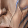
Yes, it could be because he appears to be leaning back, but the whole face looks vaguely like it's slanting backward, as if someone had squished it a bit.
I think (and it's been ages since I last drew a profile, so this could be all wrong) the entire face should come forward a bit, and the chin should be less jutting. Gah..I'm phrasing this really badly.
The chin needs to come forward a touch, I think, but the rest of the face needs to come forward even more...it's rare to see someone who's chin protrudes as much as his nose. Possibly the visor area needs to be shifted forward relative to the nose, too, so he doesn't look like he's got such recessed eyes.
Hmmm..I'll try and do an MS paint style doodle to illustrate my point..
My adjustments are (obviously) on the right: the neckline gives an idea of the shift: I pulled the face forward, rotated it down a bit to deemphasise the chin, and then pushed the visor forward a smidgen.
Anyway, that's my two cents. It looks fcking awesome anyway, so feel free to ignore me.
My adjustments are (obviously) on the right: the neckline gives an idea of the shift: I pulled the face forward, rotated it down a bit to deemphasise the chin, and then pushed the visor forward a smidgen.
Anyway, that's my two cents. It looks fcking awesome anyway, so feel free to ignore me.
Yes! That's exactly it! Man, that MSPaint edit reflects exactly how it SHOULD look. Forgot everything else, you don't want someone who appears to be leaning on thin air.
Edit:
Notice the helmet on the new one and on the old one. The old one has a bit of a pointed corner on his helmet, while the new one is smooth.
(Look at the helmet area between the nose and the upper lip to see what I'm talking about)
Edit2: The back of the helmet on the new model is a bit lower than the original.
Last edited by Sonic619 on Fri Nov 24, 2006 4:37 pm, edited 2 times in total.
I think its a definate improvememt over the original. Kudos to the artist. I think the face looks great. I would maybe make it a bit younger as befitting a grunt but thats a small thing (to make him look battleworn, I would recommend some stubble or some such). Also the skin on the cloth bits of the guy looks awesome (great camo!). The biggest improvement is probably in the legs/feet. Those look great.
My only real complaint would be the skinning/modelling on the torso armor. The pectoral and abdominal sections of the armor actually look better on the original IMO. I liked the size of the stomach armor thing on the original. I also liked the squarish shape of the pectoral armor things on the original. Also, there appears to be too big of a gap between the shoulder armor and the pectoral armor. That is a small thing though. Overall, it looks way better now. Thanks and congrats.
I think it looks really good, a nice improvement in overall quality on the original. Though I do agree with what's been said about it slanting backwards a bit and I think making that amendment that DDL illustrated would be a good idea. I mean, I know almost nothing about programming so I don't know how much work I'm asking of you but I think it would be a good idea if you want him to look as good as possible.
Hello (first post- been following the mod for quite a while now though! Really excited by it, but thought I'd sign up to help with some feedback).
Amazing work I think!
Apart from whats already been said, other small things I'd like to add;
The skin should perhaps be a little more orangey and a little less pale (I think this would also fit the battle-worn soldier feel you were going for and keep with the original).
Also, I think it generally needs to be a touch darker. I know you probably want it a little brighter than the original to show off the awesome texture re-make you did! But I'd say keep it the same kind of brightness to fit in with the original.
That's just Awesometastic! And that in the Unreal 1.0 Engine! FFS!
I agree with the critiques on the face, maybe a little less 'old man', more 'battle worn'. It might be achieved by changing the mouth a bit as was also suggested earlier.
I like the new helmet better, it makes the troopers look less like coneheads.
Sonic619 wrote:Yes! That's exactly it! Man, that MSPaint edit reflects exactly how it SHOULD look. Forgot everything else, you don't want someone who appears to be leaning on thin air.
Edit:
Notice the helmet on the new one and on the old one. The old one has a bit of a pointed corner on his helmet, while the new one is smooth.
(Look at the helmet area between the nose and the upper lip to see what I'm talking about)
Edit2: The back of the helmet on the new model is a bit lower than the original.
Had to chuckle at this one.
The reason the old one looks pointy is because there are more polies in the re-made face's upper lip than in the old MJ12 meshe's entire body ;P
Ok, maybe an exaggeration...but yeah, the old head was REALLY chunky.