Animation nerds actually got upset a few years ago because a new iteration of the classic Simpson's introduction had a lesser range of motion and had shifted details from the active foreground to the static background. You can also see that they've taken a tendency towards clearer, cleaner frames, stylizing things like their teeth (we now rarely see both rows of teeth separate and even more rarely are individual teeth rendered) and shifting to a clearer color palette and linework (due to increased definition tv).Cybernetic pig wrote:I'm unsure about "streamlined". Sure the finalized style of character design is more simplistic looking, however the animations have far more frames, and the backgrounds feature much more definition.Season One Simpsons weren't particularly easy on the eyes. They've streamlined, experimented and refined a lot over the years. However the principle remains constant.
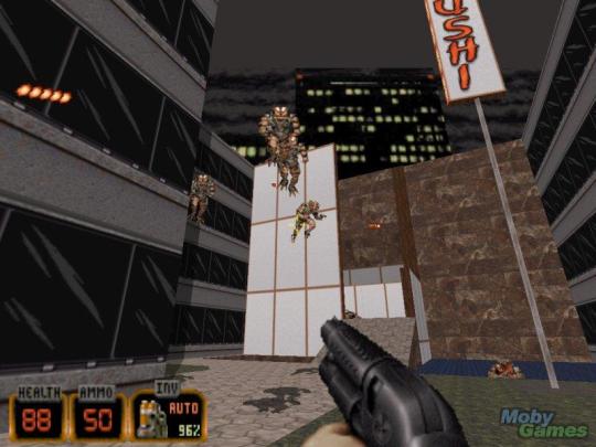
Season One, Episode Five

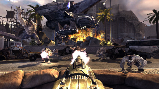
Season Twenty-five, Episode Five

You can see that backgrounds have more "definition" now but they're in a manner that's selective. Little details like scratches in the wall work fine now that it's high definition and these can be included clearly without distracting. They still rely heavily on repeatition of similistic geometric shapes and shading is only used when it's in the distance, a massive object or a really complex stylized to be simple enough it's not distracting (like a tree). Scenes where characters are going to return to and be at for long periods have complicated backgrounds, while others have simple and/or reptitious backgrounds.
Early episodes sometimes had ridiculous amounts of detail and clutter in backgrounds, but the mileage varied wildly.
I'm going to be honest, I don't really care for pretty. I love beauty, don't really care for pretty.The big picture is much prettier with HDTP and New Vision, and the flaws few and far between and easily fixable in the grand scheme. It is worth it.Again it comes down to my fixation with the big picture. Not being able to read the plaques on memorials never bothered me because it made sense that the wear and tear would make the illegible and the priority was it was a site that enshrined history rather than the details on the real historical event.
Particularly because things like the shift from "functional and charming" in Duke Nukem 3D
And trying to "pretty" up every aspect of it and then incorporate other idea in game development, Duke Nukem Forever
I also don't really care for detail if it can distract from the core. You can implement a lot of detail and believability without ruining priorities, but large blocks of unrelated flavor text on a shiny brass plaque in a delapidated memorial. One bit of popular media that's basically a master class on that is the TV show Archer. Here's a panel that you can read for ten seconds or an hour:
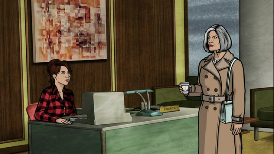
These backgrounds are lovingly painted over 3d generated images to ensure perfect perspective and consistency between angles and giving them loving subtle textures and potential details. Up to and including the abstract painting behind Cheryl. There's also some concession details like how Cheryl's plaque is easily readable even though it would probably be hard to make out at that angle due to reflection etc.
It works because the figures in Archer are so well defined, stand out clearly due to be stylized and hence immediately draw in your attention (along with their props). When you're done looking at them your eyes can wander to appreciate the background, but even you don't get time for that the general aesthetic of the background sinks in immediately. It's an older than dirt trick in animation but it works in video games. You can see the evolution of it's use in the Borderlands Franchise.
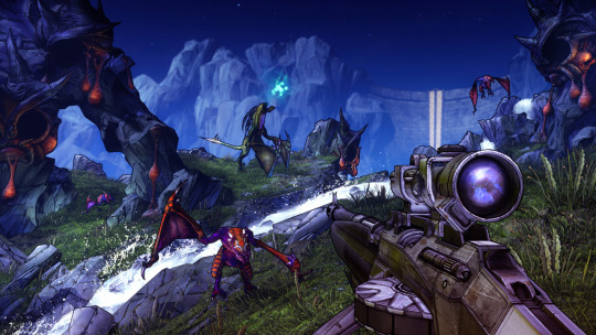
Borderlands
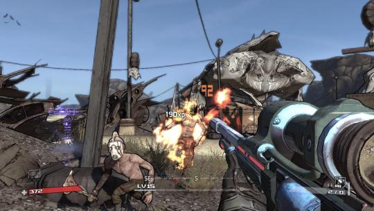
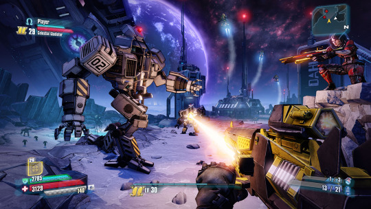
Borderlands 2
Borderlands: The Pre-Sequel
This is also why inconsistencies can disproportionately ruin an experience, kind of like Clipart.
It's not so much less is more as the need to respect the standard of the base product. I fully believe that the unpolished areas, minimalist graphics (even for the era) and basic assets are part of the concessions that had to be made not just for the sake of project management (a good topic today, rather than a perfect product never) and the inherent limitationon of a single CD and a lot of settings, props and voice acting.You're very much arguing from the stance of "less is more", which is unusual for DX considering its comprehensive kitchen sink design that resulted in many aspects being left unpolished. Still, a lot of your points are absolutely valid and yes, less can be more if more is just badly implemented, but I don't think that is the case for HDTP + New Vision in most respects.
Mods being done as personal practice of course, don't have to worry about this. You can do a mod to reskin and re-model your favourite character and people who also love that character will appreciate it regardless of what it does to the overall aesthetic. However, for a mod to be an overall improvement (which is what you want if you're going to package it in) you want it to take into account things like what prioritizing and maintaining consistency.
One of the most obvious quirks of HDTP for instance, is that Bob Page looks unimportant compared to Walton Simmons. This isn't a problem if you're just playing so you can experience the new visuals or something new, but it is a baffling quirk if you're going in expecting to experience the story similarly or more intensely than you did the first time (or a new player or one who never finished the original).
So rather than less is more, I'm in favour of embracing stylizing as a means of prioritizing. Do some things simply so you can do other things amazingly.


