Deus Ex Fan Art by EXE

UFOs, lost socks, discuss whatever you like here.

Moderators: Master_Kale, TNM Team

User avatar
Deus.EXE
NSF
Posts: 53
Joined: Sun Jan 22, 2006 11:13 am

Deus Ex Fan Art by EXE

Post by Deus.EXE »

Image
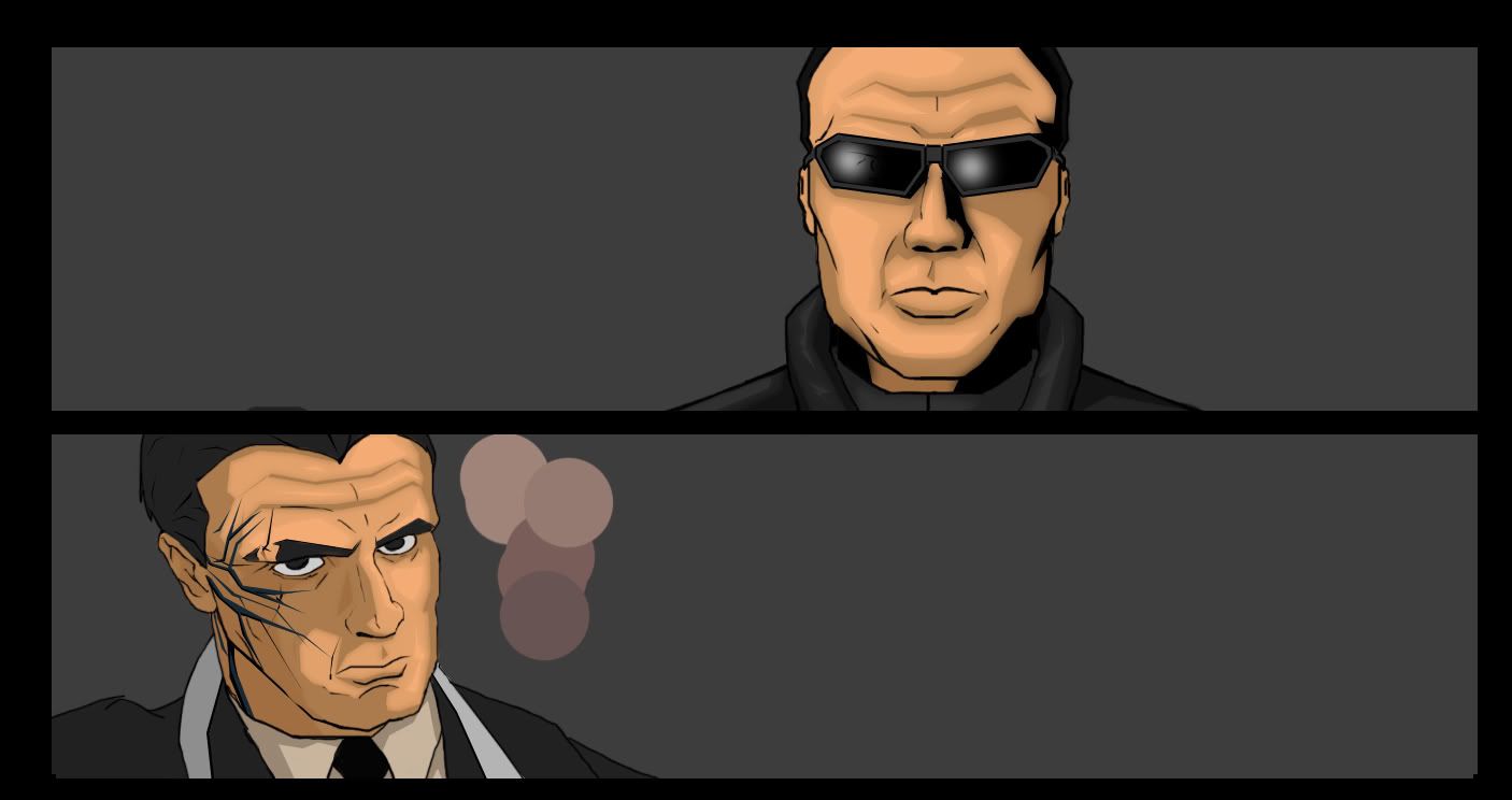
Working on a three panel comic page depicting the confrontation of JC and Simons. All I have done so far is what you see. No Backdrop, no details...etc
Image

http://robocoparchive.com
RoboCop Archive Admin #2
User avatar
Jonas
Off Topic Productions
Posts: 14224
Joined: Sat Apr 24, 2004 9:21 pm
Location: Hafnia

Post by Jonas »

I'm probably going to want to use that in TNM. For wall deco. You know, kinda like those cartoony works of art some people have hanging around.

You can never have too much wall deco.

You'll get a mention in the credits of course. Could you send it to tnm@offtopicproductions when you're done? :)
Jonas Wæver
Chief Poking Manager of TNM

I've made some videogames:
Expeditions: Rome
Expeditions: Viking
Expeditions: Conquistador
Clandestine
User avatar
Deus.EXE
NSF
Posts: 53
Joined: Sun Jan 22, 2006 11:13 am

Post by Deus.EXE »

Sure.

I have Simons... But... I just don't like it.

Image

(Yes.. I know I didn't add the other side of the facial augments or jacket details...)

I dunno. I actually like how JC came out... but with Simons I can't really say "Yeah, that's nice." And I've always told myself 'If you have to question it yourself, you know something is wrong.'.
I'm not sure... He looks somewhat 'Harrison Ford'-ish. And though he's supposed to look old... he doesn't.
Maybe I should darken the layers.

Depending on feedback, I might just start Simons from scratch.
Image

http://robocoparchive.com
RoboCop Archive Admin #2
User avatar
Phasmatis
Off Topic Productions
Posts: 2057
Joined: Sun Apr 25, 2004 7:55 am
Location: UK
Contact:

Post by Phasmatis »

I think they both look superb, Simons would perhaps look more like Simons if you make the augs blue, the hair is different too if I remember correctly, I think the sides are shaved but still, VERY nice images. :D
Keeper of the pointy stick of injustice™.
User avatar
Deus.EXE
NSF
Posts: 53
Joined: Sun Jan 22, 2006 11:13 am

Post by Deus.EXE »

Ah, see I just color grabbed off of a screen shot I took of his model in the underground level in the SDK.
http://i8.photobucket.com/albums/a24/De ... 100520.jpg
I only do so because I'm colorblind.

And yeah... I tried to shave the sides of his head, but with my complaints about him earlier he just looked like Moe from the 3 Stooges.
Image

http://robocoparchive.com
RoboCop Archive Admin #2
Darkshade
HDTP Member
HDTP Member
Posts: 487
Joined: Tue Dec 20, 2005 3:39 am
Location: Washington, USA

Post by Darkshade »

Sw337!
If you get a few more done, maybe these could be used in a montage while the HDTP is installing?
that guy
The Nameless Mod
The Nameless Mod
Posts: 1312
Joined: Mon Apr 26, 2004 1:54 am
Location: Perth, Western Australia

Post by that guy »

yeah JC looks really good. Simons also looks good but nto much like him IMO.
User avatar
Deus.EXE
NSF
Posts: 53
Joined: Sun Jan 22, 2006 11:13 am

Post by Deus.EXE »

Image
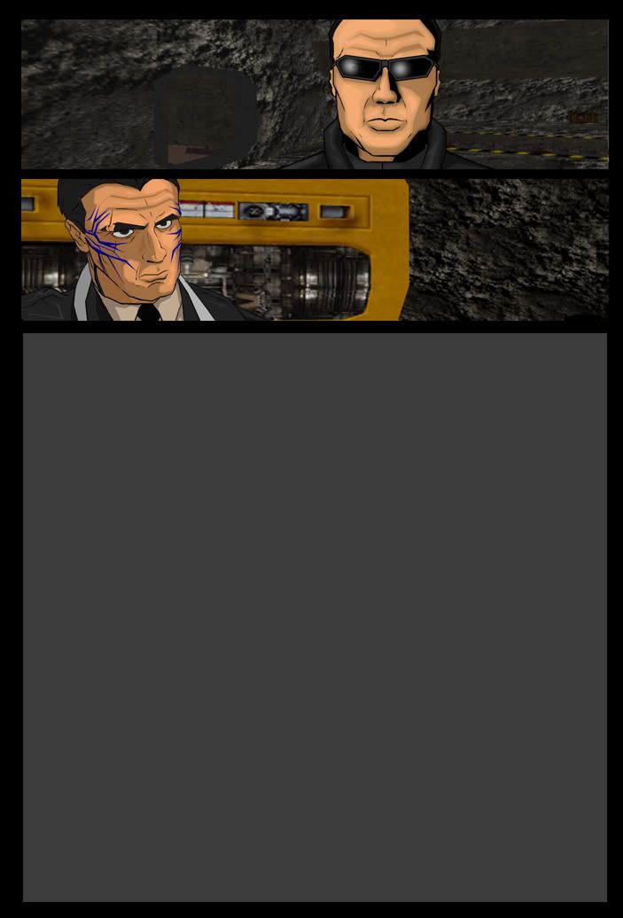
As I was doing the backgrounds, I took some snap shots from the SDK (So I can look at them as images, because having both Photoshop and the SDK open at the same time eats a lot of memory.)
After some toying around I altered the images just enough that they themselves could be used as the BG. (Sure... the poor man's way of doing things... But hey.)

Hm... after previewing...
For some reason the image comes in a LOT brighter here then when it is in Photoshop.
Im all up for opinion. If you think I should just do the BG by hand, then let me know.
Image

http://robocoparchive.com
RoboCop Archive Admin #2
DDL
Traditional Evil Scientist
Posts: 3791
Joined: Mon Oct 17, 2005 10:03 am

Post by DDL »

When you took those screenshots, did you have dynamic lighting on, or just textures? Looks like the latter, which'd certainly explain the brightness.

Presumably dynamic lighting mode would be nicer? Or would that not match the sort of cell-shaded look to the foreground?

Nice work, btw.
User avatar
Deus.EXE
NSF
Posts: 53
Joined: Sun Jan 22, 2006 11:13 am

Post by Deus.EXE »

With Dynamic lighting on it was nearly pitch black.
But I meant even after I darkened the images with the Burn tool.
Image

http://robocoparchive.com
RoboCop Archive Admin #2
EER
Illuminati
Posts: 2486
Joined: Sat Oct 22, 2005 7:52 pm
Location: NL

Post by EER »

Looking great :D

Especially since you're also color blind, respect! :giggle:
User avatar
Deus.EXE
NSF
Posts: 53
Joined: Sun Jan 22, 2006 11:13 am

Post by Deus.EXE »

Actually I am really not liking the background. I'm going to try to do it myself.
Image

http://robocoparchive.com
RoboCop Archive Admin #2
Fox Hound
Thug
Posts: 38
Joined: Wed Feb 08, 2006 2:25 pm

Post by Fox Hound »

Looking great! As I was reading through I thought, "1 major problem, He should do the background himself". Then I saw your last post. Definatly give it a go. If you cant manage it (there is a lot of setail there) a good effect that I've seen used in comics is to just slap it in photoshop and apply an artistic layer, mabie Pallette knife and mild blur.

Image
User avatar
Dragon
Silhouette
Posts: 609
Joined: Sun Oct 23, 2005 9:20 pm
Location: switzerland
Contact:

Post by Dragon »

i would personally settle for a self drawn background in the style of the characters. looks a bit odd with cartoony charas on a 3d background.
Leader and Head Programmer: Epsylon, Drag[en]gine Game Engine (Alt-Page) and others
that guy
The Nameless Mod
The Nameless Mod
Posts: 1312
Joined: Mon Apr 26, 2004 1:54 am
Location: Perth, Western Australia

Post by that guy »

I actually thought the backgrounds looked really good with the exception of that yellow thing in the lower one. perhaps you could just redraw -that- part.
Post Reply